
I used graphic design tools to simulate and test the D3.JS visualization diagrams, and quickly iterated for researching the optimum with viz developer.
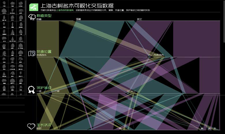
Based on Shanghai Municipal Government OpenData Database, we aim to create a new connection between the citizens and government. With the utilization of OpenData Visualization to get more information related their rights, citizens will be able to involve in the governmental decision making process more actively and independently.
The shortage of Waterfall Graph is because of its scale. Water Graph is a good and intriguing visualization diagram when there is few data figures. However, it is helpless to present high dimensional data in this project.
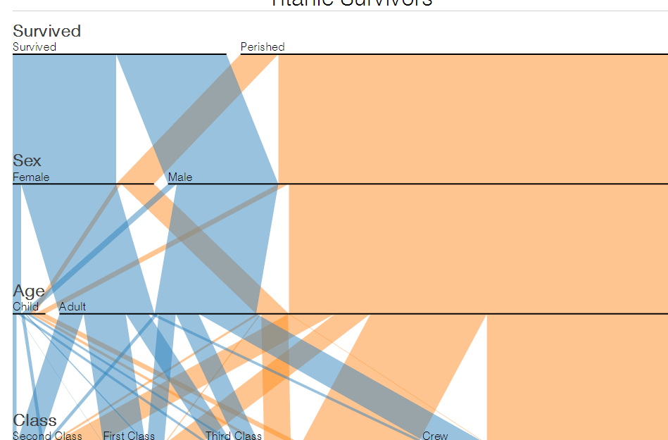
↑ D3.js Viz patterns
→ The initial waterfall graph I designed
Bubble Graph has presented a better visualization of data, but it is still hard to display the figures of the aged trees like growth condition, endangered degree, protect status and so forth.
↑
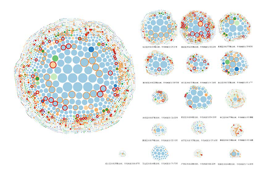
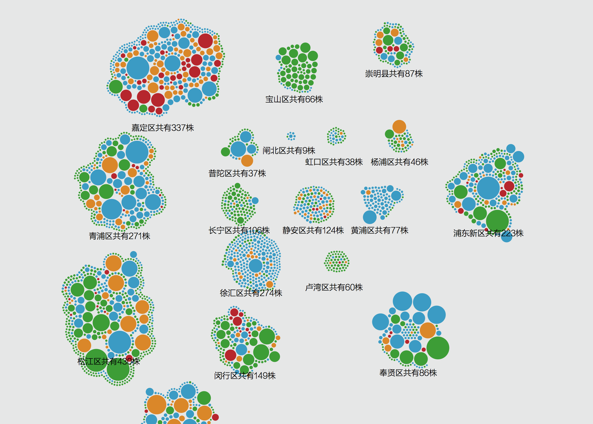
Grouped by city districts
←
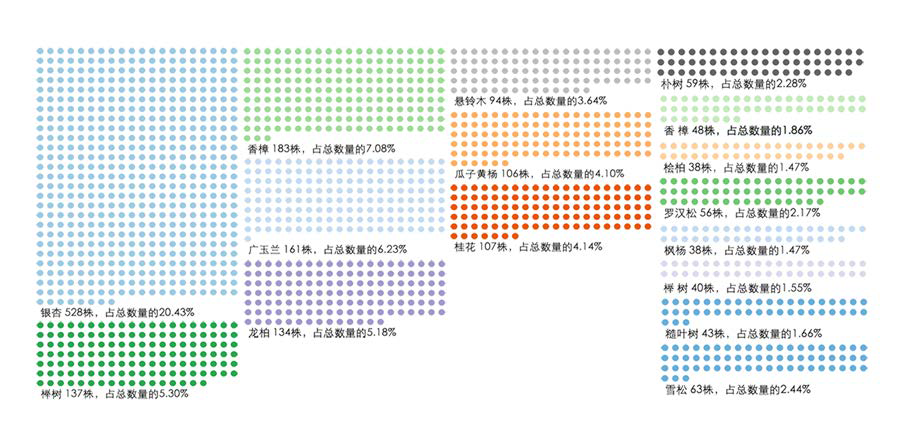
Grouped by trees species
Traffic Distribution (Downtown/Centre ring/ suburb)
Quantitative distribution in city districts
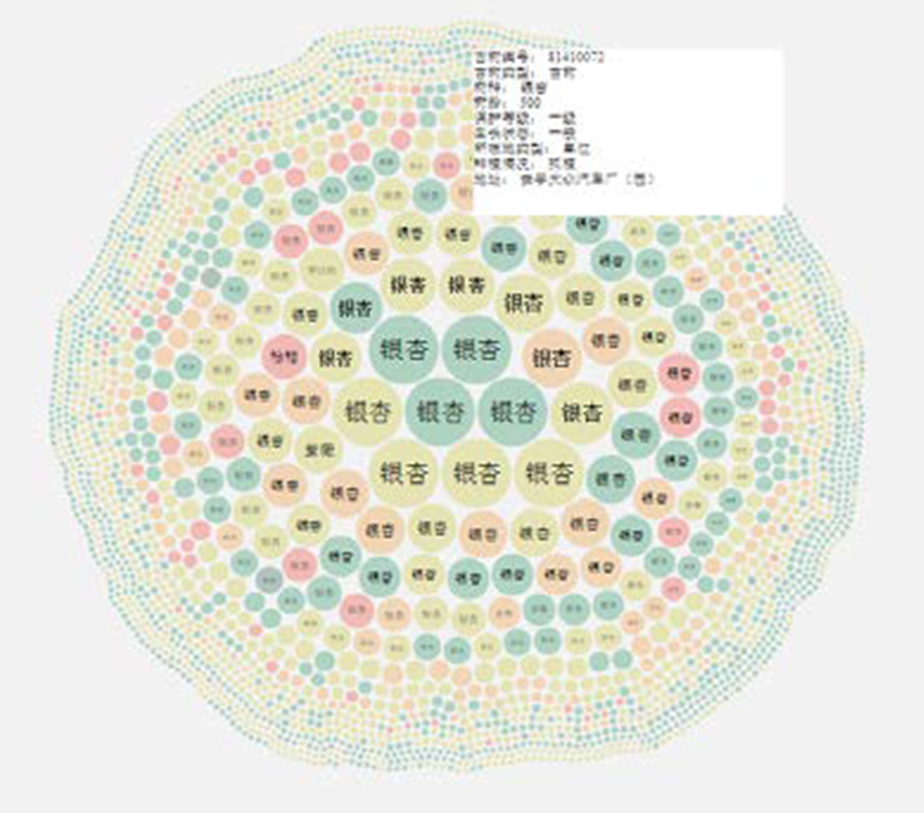
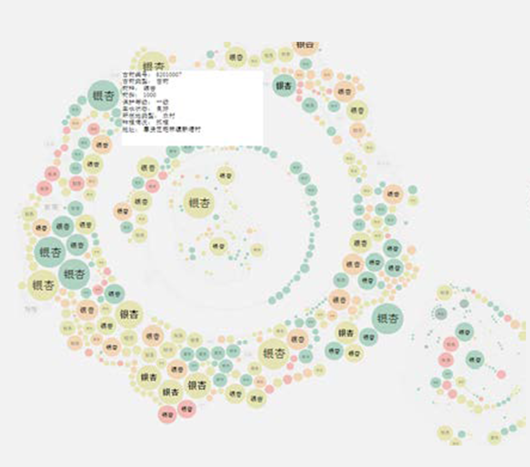
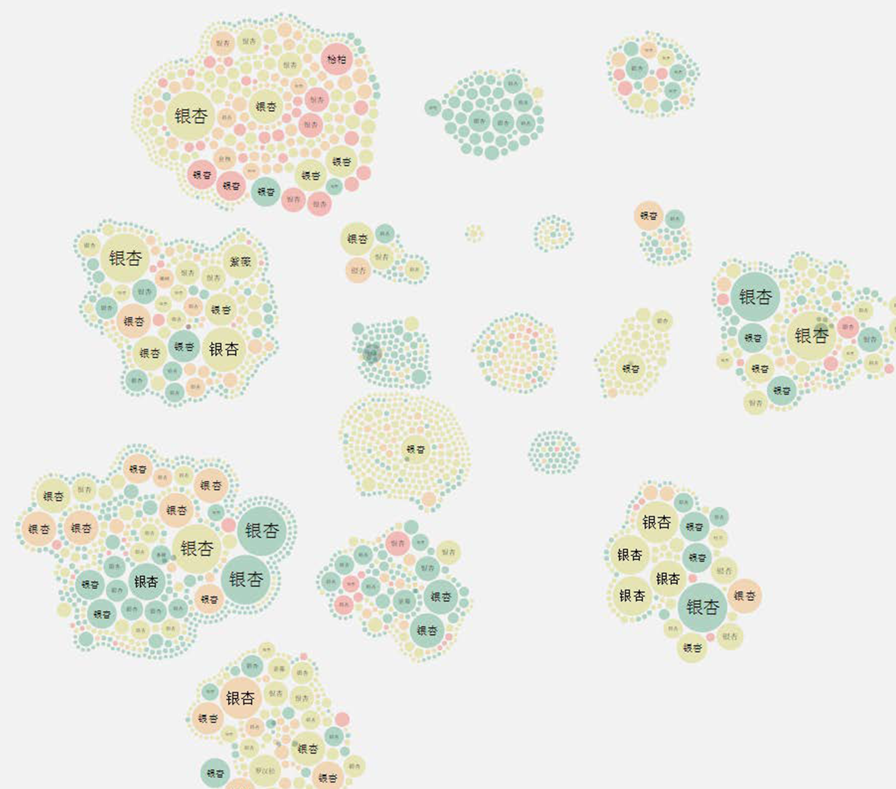
Trees age (the bubble size represent its age)
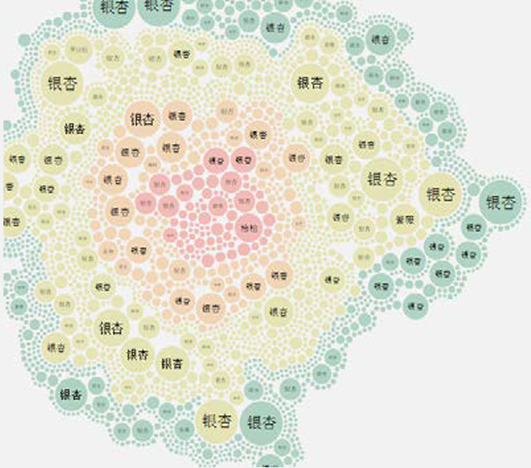
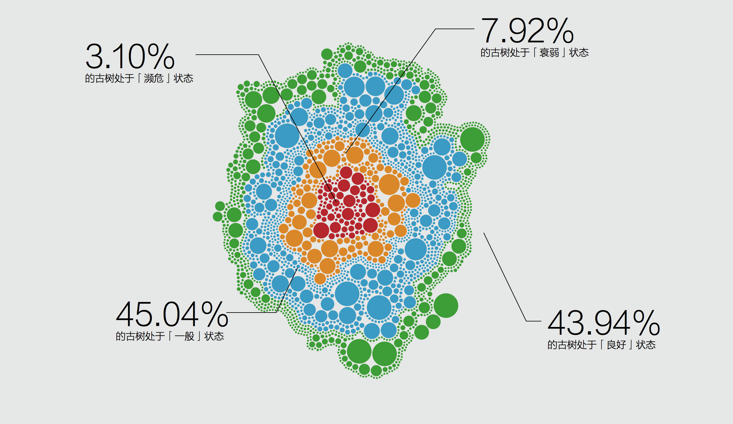
Health Condition (the bubble color represent its condition)
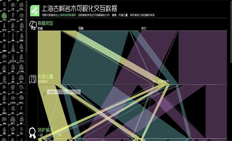
After the previous iteration, I realized the importance of user-readability when designing for normal users who don't have relative backgrounds. So I made some data conclusion for the users rather than let the users to interpret by themselves.
The bubble color represents the tree's health condition, and the bubble size represents their age.
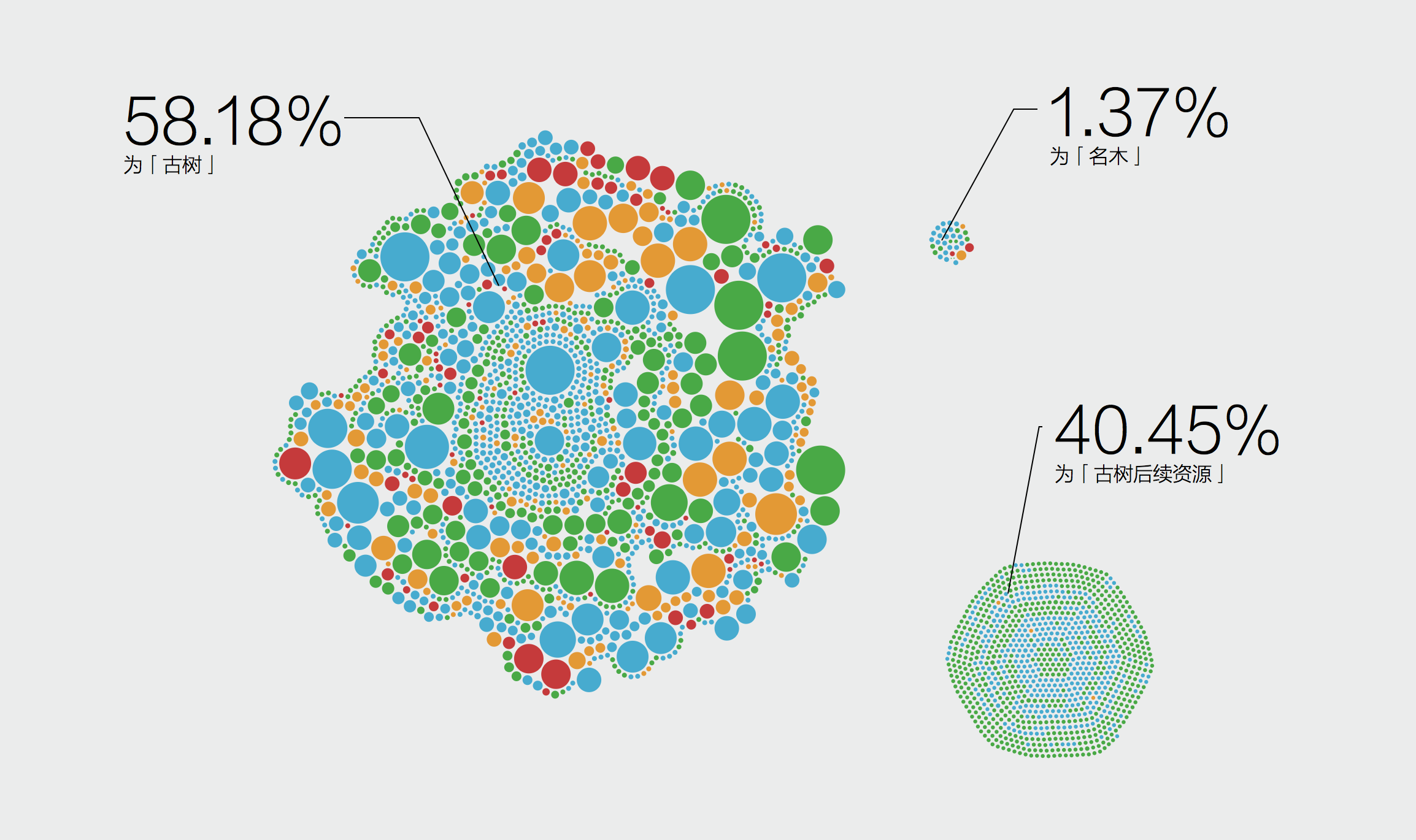
There are about 58.18% trees in Shanghai are Aged Trees, 40.45% are normal trees and 1.39% are rare trees.
There are 18 districts in Shanghai, and Songjiang District contain the biggest quantity of trees.
The trees in Jiading District having the worst health problem.
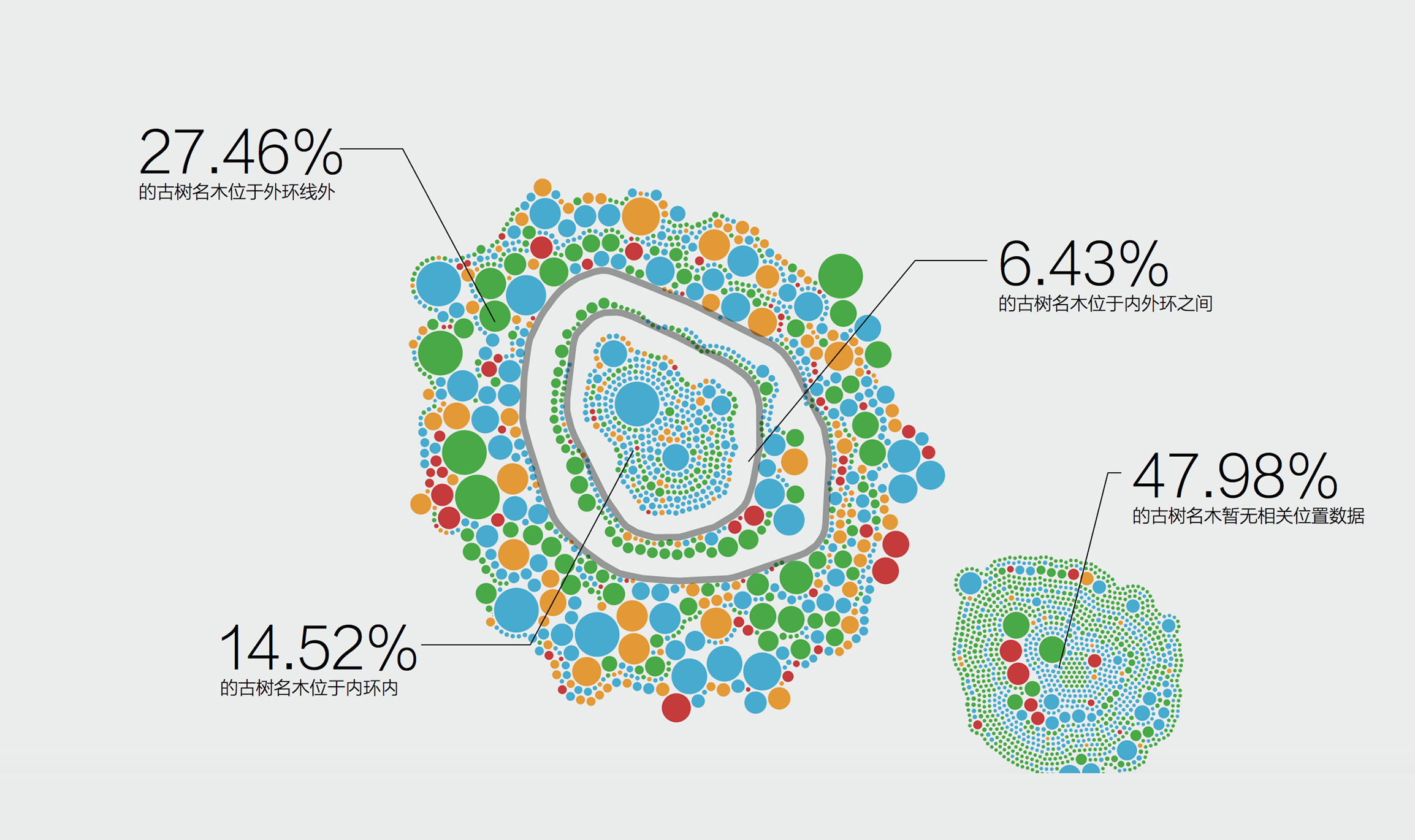
There are 14.52% trees in Shanghai are located in downtown, 6.43% trees are located in Centre ring and 27.64% tress are are growing in suburb.
However, there are 47.98% trees lost location data.

© 2017 Xunan Zhou All rights Reserved